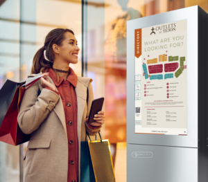
Not All Technology Is Created Equal
It started with a call from my mother. She was standing in the middle of one of the most famous malls in Houston — you’d know it if I named it — frustrated, confused and stuck at a giant digital kiosk.“Ajay,” she said, “this thing doesn’t make any sense. The map is huge and there are squares everywhere. I can’t tell where I am and can’t find Ann Taylor. I just keep tapping and going in circles. I really hope this isn’t one of your kiosks?!”
For context, my mom is a pro at navigating her local mall in Dallas. She knows the shortcuts, the anchor stores and the best coffee spots. But here, in unfamiliar territory, the digital map made things worse — not better.
First, I assured her: it wasn’t a TouchSource map. It was one of those full-screen directory maps — technically detailed but visually barren. Every store was just a shape, there was no intuitive use of color, landmarks weren’t clear and the “You Are Here” marker? Was more like “You Might Be Here.” Eventually, she gave up and asked a stranger for help.
Sadly, she’s not alone. I recently came across a guest column on Sixteen:Nine about poor wayfinding design. Too many digital directories look slick but fail at their main job — helping people get where they need to go with ease and confidence.
Here’s the thing — our brains aren’t wired to make sense of empty shapes.
Research shows that people:
- Rely on large anchors like major stores or landmarks to orient themselves
- Use color contrast and zones to mentally segment space
- Need a full view of the layout to build an internal map — zoomed-in sections just add confusion (Source: Montello, 1998; Golledge, 1999 on spatial cognition)
When maps skip these elements, visitors feel lost, overwhelmed and even excluded — especially older adults, those with low vision and anyone new to the environment. I’m not a navigation expert, but I know this: if I can’t anchor myself in a space, the rest doesn’t matter.
How can this be easier?
At TouchSource, we do things differently. We believe wayfinding should feel natural, not like solving a puzzle. Our approach is guided by a few key principles:
- Flexible Maps: We start with any base map, then add smart layers of color, icons and visual anchors to reflect how people experience the space
- Full View First: We always show the entire layout up front — because orientation begins with seeing the big picture
- Visual Anchors: Big destinations like Macy’s, food courts or hospital wings are highlighted clearly — not buried in a list
- Adaptive Journey: Our maps adjust as users move through floors, wings or zones — offering step-by-step clarity
- Built-In Accessibility: We design for clarity — high contrast, large fonts and intuitive layouts make our maps inclusive for everyone
And because the world is becoming more digital and connected, I’m excited to share that TouchSource maps can now be deployed in any format — not just kiosks.
You can embed our interactive maps into your website, mobile app or in-building displays. So whether someone is planning ahead or already on site, they get the same clear, user-friendly experience. Because every visitor deserves to feel confident and welcome — whether at their local mall or a brand-new destination. And every wayfinding experience should feel as easy as getting directions from a trusted friend. (Or a quick call to your son.)
Happy Mother’s Day to all moms out there.
